
The science of the perfect landing page
By thatonesupport
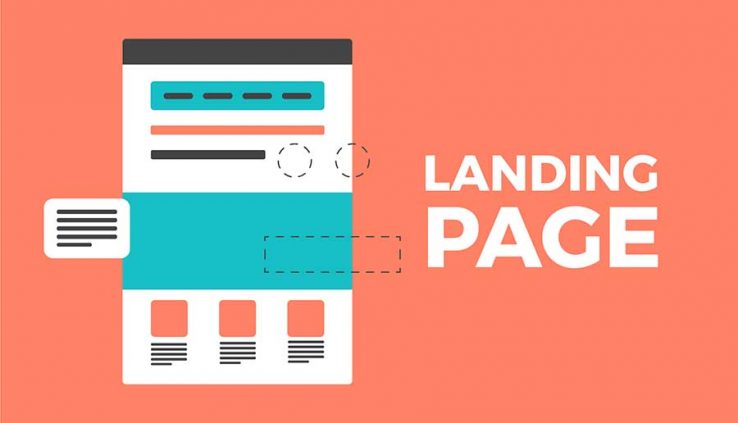
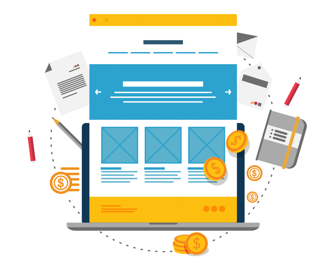
A landing page is an online page that prompts visitors to take action. The action can be anything from signing up to a newsletter or downloading a brochure to buying a product or a service. Its purpose is to generate interest, encourage interaction, capture leads and finally convert visitors into customers or fans.
A landing page is different from a homepage, which usually presents an overview of the product or service promoting discoverability because it focuses on just one desirable action. An LP is often the first point of contact with your brand and your unique chance to bring people in and win them over.
As you might have guessed, designing an LP can get really scientific as it requires combining various principles coming from Psychology, Marketing UX and Visual Design. The careful and balanced application of these principles will aid you to design a highly successful and utterly valuable landing page. In this article, I will provide a formula built around the axes of perception and persuasion to help you design the perfect landing page.
Perception
Perception is the ability to become aware and understand our surroundings through our senses. Visual perception, specifically, is the ability to perceive the world through the light that enters our eyes. There are a few ways to assist visual perception and create more effective landing pages.
Create some breathing space
White space is the empty or low in information areas of the design. It’s also the space between individual design elements like typography, paragraphs, buttons, images and so on. It is the breathing space that guides the eye around the page, makes the content easily scannable, increases readability and visual hierarchy improving comprehension. It helps with focus and can be used strategically around buttons, for example, to boost their visibility.
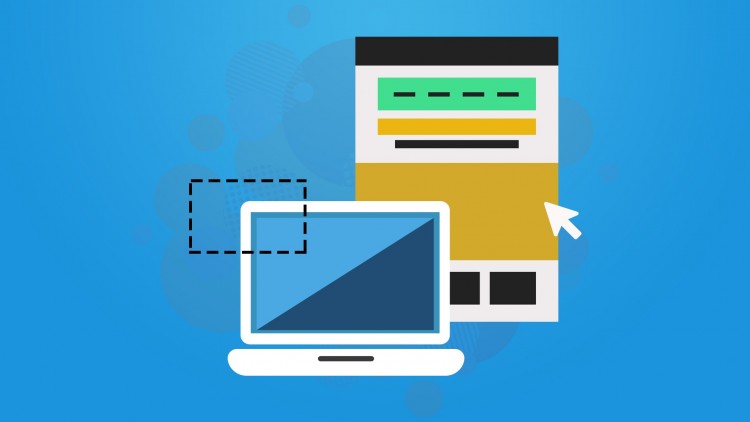
Place your content strategically
Studies have shown we scan web pages heavy in content following an F shaped pattern. While for pages with less content our eyes move following a Z pattern. The Z pattern is usually the most suited for the shorter and more focused Landing Pages. Placing key elements like significant information and buttons on the F or Z areas will help with content discoverability and will boost conversion.
Establish a strong visual hierarchy
Visual hierarchy refers to the visual weight of graphic elements and their arrangement in a way which allows people to comprehend and navigate through content effortlessly. By assigning different visual weights to the page elements, you can influence the order in which people perceive information and interact with the content. Colour, font size or weight, imagery and video can be used to boost hierarchy.
Group information
Proximity, Similarity and Common Region are the most essential Gestalt principles to apply for grouping information. The Proximity principle states that related items should stay close to each other, while the unrelated ones should stay further apart, and this will boost visual hierarchy and scannability. Similarly, the Common Region principle states that visual elements placed within the same region are perceived as related, and this helps with grouping information or actions. The Similarity principle states that look-alike objects are perceived as related, and this helps with organising and associating them with a specific meaning or function.
A landing page is an online page that prompts visitors to take action. The action can be anything from signing up to a newsletter or downloading a brochure to buying a product or a service. Its purpose is to generate interest, encourage interaction, capture leads and finally convert visitors into customers or fans.
A landing page is different from a homepage, which usually presents an overview of the product or service promoting discoverability because it focuses on just one desirable action. An LP is often the first point of contact with your brand and your unique chance to bring people in and win them over.
As you might have guessed, designing an LP can get really scientific as it requires combining various principles coming from Psychology, Marketing UX and Visual Design. The careful and balanced application of these principles will aid you to design a highly successful and utterly valuable landing page. In this article, I will provide a formula built around the axes of perception and persuasion to help you design the perfect landing page.
Perception
Perception is the ability to become aware and understand our surroundings through our senses. Visual perception, specifically, is the ability to perceive the world through the light that enters our eyes. There are a few ways to assist visual perception and create more effective landing pages.
Create some breathing space
White space is the empty or low in information areas of the design. It’s also the space between individual design elements like typography, paragraphs, buttons, images and so on. It is the breathing space that guides the eye around the page, makes the content easily scannable, increases readability and visual hierarchy improving comprehension. It helps with focus and can be used strategically around buttons, for example, to boost their visibility.
Place your content strategically
Studies have shown we scan web pages heavy in content following an F shaped pattern. While for pages with less content our eyes move following a Z pattern. The Z pattern is usually the most suited for the shorter and more focused Landing Pages. Placing key elements like significant information and buttons on the F or Z areas will help with content discoverability and will boost conversion.
Establish a strong visual hierarchy
Visual hierarchy refers to the visual weight of graphic elements and their arrangement in a way which allows people to comprehend and navigate through content effortlessly. By assigning different visual weights to the page elements, you can influence the order in which people perceive information and interact with the content. Colour, font size or weight, imagery and video can be used to boost hierarchy.
Group information
Proximity, Similarity and Common Region are the most essential Gestalt principles to apply for grouping information. The Proximity principle states that related items should stay close to each other, while the unrelated ones should stay further apart, and this will boost visual hierarchy and scannability. Similarly, the Common Region principle states that visual elements placed within the same region are perceived as related, and this helps with grouping information or actions. The Similarity principle states that look-alike objects are perceived as related, and this helps with organising and associating them with a specific meaning or function.
Make your CTA visible and clickable
In a Landing Page, the call-to-action is the number one element that needs to always be visible and easy to target. A unique, bright or high in contrast colour with white space around it, will help it stand out. A bold and clean font will make it easy to read. While, according to Fitts law, making it big and placing it in proximity to the cursor or finger will make it easier to interact with.
Boost readability with the use of visual prompts
Color, iconography, imagery, video, typography, titles, paragraphs and bullet points are all examples of visual elements that can be used to boost readability and improve the performance of your landing page.
Color has the ability to generate emotions, classify information and create a visual language. Iconography, imagery and video will support complicated ideas or just make the content more interesting and less overwhelming. Clean typography in different sizes and weights will improve legibility while assisting hierarchy. Short paragraphs and bullet points will help people focus their attention, read and understand the information presented with ease.
Be specific and avoid jargon
Clarity is possibly the most important principle to apply. For people to act, they have to understand your offering. Get to know your audience and use the language that they comfortably understand. Avoid jargon and don’t get too gimmicky trying to be smart or funny. Get to the point and value of your product or service as soon as possible with as fewer words as possible.
Keep it short
Research indicates that the average line length for supporting readability is about 70 characters, including the spaces. Additionally, successful paragraphs are no more than five or six sentences long without exciting the 200 characters mark. Breaking down the content in short digestible sections will improve your page’s performance.
“Removing page elements can be just as effective at increasing conversions as adding or tweaking elements on a page.” – Mona Elesseily
Same goes for forms as they have to be as compact as possible, asking only for the most essential information while offering pre-filled options. The shorter and clear the form is, the more likely it is to be filled.
Persuasion
Persuasive design is focusing on influencing human behaviour, and it starts with knowing your audience their goals, pain points and motivations. You have to present people with incentives that encourage them to act now rather than later. You have to make sure you incorporate persuasion technics relevant to your value proposition.
Craft an appealing and descriptive headline
You only get one chance at a first impression, and a carefully crafted headline will help spark interest and capture visitors’ attention. It is important that the headline is short, a maximum of 15 words, and its message is strong enough to grab people’s attention. A successful headline is legible while clearly describes the purpose of the page or what people are going to get from it.
Eliminate distractions by reducing choice
Hicks law states that the time it takes for a person to make a decision is proportional to the number of choices available. Increasing the number of choices will increase the decision time. So, eliminating options will help people act faster and with confidence.
A high-converting landing page is minimal, has no distractions and one purpose. Therefore, a successful LP has no irrelevant content, unnecessary links or navigation and just one prominent call-to-action. This helps visitors stay on the page, focus on the main action and convert.
Create positive emotional connections
Decision making isn’t as rational as we want to believe. It’s an unconscious process with emotion being its number one influencer. Knowing your audience and what kind of emotions would help them form an emotional connection with your brand is the key. The next step is to eliminate any negative emotions like fear, stress, frustration and annoyance by removing friction, providing a familiar and seamless experience. Then you have to generate positive emotions like trust, joy, belonging and enthusiasm by applying aesthetic, convenient and transparent design in combination with intelligible and helpful messaging.
Communicate value
To determine what’s valuable to your audience, you have to know their pain points, goals and “secret” wishes. Then you have to focus on how you can help them solve their problems, achieve their goals and improve their lives. Remember that it’s not about how good you are but about them and how you can make their life better. A way to do that is by presenting a clear, short and easy to digest list of benefits crafted around them while anticipating their questions and addressing their concerns.
Create urgency
Urgency only works if your product or service is something that people are actively looking to purchase. If visitors are already seriously thinking about converting this trick will give them a gentle nudge. Adding urgency can be achieved by setting a deadline, implying scarcity with limited items or a high volume of interest. Time-related words like ‘now’, ‘one time only’, ‘last chance’, ‘ending soon’ are also especially useful if you want to create a sense of urgency.
Give more
Offer a bonus or a surprise, something easy for you but convenient or valuable for your visitors. Offer more than expected, when least expected. This will put people into a good mood and make them like you more. As a result, they will feel an obligation to give back and will be more prompt ‘yes’ to your product or service.
Provide social proof
Social proof refers to the psychological phenomenon of getting influenced by other peoples’ decisions or actions, especially when we are unsure about our own. Seeing large numbers of people doing something makes us think, it’s the correct thing to do. Testimonials, ratings & reviews, case studies and social data can be used to convey credibility and promote adoption or acceptance of your brand.
Build trust
A great way to build trust is by using authority figures. Widely accepted, trustworthy experts or organisations tend to influence people. Use expert reviews, endorsements, awards and security logos to provide reassurance and establish credibility. Another way to promote trust is with consistent design and language, transparency and by keeping your promises.
Conclusion
Every good design starts with empathising and designing the perfect landing page isn’t an exception. Empathy allows us to put ourselves in our visitors’ shoes and connect with them in a deeper level. It is the single most important step and the key to unlock your pages’ full potential.
rt, and this will boost visual hierarchy and scannability. Similarly, the Common Region principle states that visual elements placed within the same region are perceived as related, and this helps with grouping information or actions. The Similarity principle states that look-alike objects are perceived as related, and this helps with organising and associating them with a specific meaning or function.
Make your CTA visible and clickable
In a Landing Page, the call-to-action is the number one element that needs to always be visible and easy to target. A unique, bright or high in contrast colour with white space around it, will help it stand out. A bold and clean font will make it easy to read. While, according to Fitts law, making it big and placing it in proximity to the cursor or finger will make it easier to interact with.
Boost readability with the use of visual prompts
Color, iconography, imagery, video, typography, titles, paragraphs and bullet points are all examples of visual elements that can be used to boost readability and improve the performance of your landing page.
Color has the ability to generate emotions, classify information and create a visual language. Iconography, imagery and video will support complicated ideas or just make the content more interesting and less overwhelming. Clean typography in different sizes and weights will improve legibility while assisting hierarchy. Short paragraphs and bullet points will help people focus their attention, read and understand the information presented with ease.
Be specific and avoid jargon
Clarity is possibly the most important principle to apply. For people to act, they have to understand your offering. Get to know your audience and use the language that they comfortably understand. Avoid jargon and don’t get too gimmicky trying to be smart or funny. Get to the point and value of your product or service as soon as possible with as fewer words as possible.
Keep it short
Research indicates that the average line length for supporting readability is about 70 characters, including the spaces. Additionally, successful paragraphs are no more than five or six sentences long without exciting the 200 characters mark. Breaking down the content in short digestible sections will improve your page’s performance.
“Removing page elements can be just as effective at increasing conversions as adding or tweaking elements on a page.” – Mona Elesseily
Same goes for forms as they have to be as compact as possible, asking only for the most essential information while offering pre-filled options. The shorter and clear the form is, the more likely it is to be filled.
Persuasion
Persuasive design is focusing on influencing human behaviour, and it starts with knowing your audience their goals, pain points and motivations. You have to present people with incentives that encourage them to act now rather than later. You have to make sure you incorporate persuasion technics relevant to your value proposition.
Craft an appealing and descriptive headline
You only get one chance at a first impression, and a carefully crafted headline will help spark interest and capture visitors’ attention. It is important that the headline is short, a maximum of 15 words, and its message is strong enough to grab people’s attention. A successful headline is legible while clearly describes the purpose of the page or what people are going to get from it.
Eliminate distractions by reducing choice
Hicks law states that the time it takes for a person to make a decision is proportional to the number of choices available. Increasing the number of choices will increase the decision time. So, eliminating options will help people act faster and with confidence.
A high-converting landing page is minimal, has no distractions and one purpose. Therefore, a successful LP has no irrelevant content, unnecessary links or navigation and just one prominent call-to-action. This helps visitors stay on the page, focus on the main action and convert.
Create positive emotional connections
Decision making isn’t as rational as we want to believe. It’s an unconscious process with emotion being its number one influencer. Knowing your audience and what kind of emotions would help them form an emotional connection with your brand is the key. The next step is to eliminate any negative emotions like fear, stress, frustration and annoyance by removing friction, providing a familiar and seamless experience. Then you have to generate positive emotions like trust, joy, belonging and enthusiasm by applying aesthetic, convenient and transparent design in combination with intelligible and helpful messaging.
Communicate value
To determine what’s valuable to your audience, you have to know their pain points, goals and “secret” wishes. Then you have to focus on how you can help them solve their problems, achieve their goals and improve their lives. Remember that it’s not about how good you are but about them and how you can make their life better. A way to do that is by presenting a clear, short and easy to digest list of benefits crafted around them while anticipating their questions and addressing their concerns.
Create urgency
Urgency only works if your product or service is something that people are actively looking to purchase. If visitors are already seriously thinking about converting this trick will give them a gentle nudge. Adding urgency can be achieved by setting a deadline, implying scarcity with limited items or a high volume of interest. Time-related words like ‘now’, ‘one time only’, ‘last chance’, ‘ending soon’ are also especially useful if you want to create a sense of urgency.
Give more
Offer a bonus or a surprise, something easy for you but convenient or valuable for your visitors. Offer more than expected, when least expected. This will put people into a good mood and make them like you more. As a result, they will feel an obligation to give back and will be more prompt ‘yes’ to your product or service.
Provide social proof
Social proof refers to the psychological phenomenon of getting influenced by other peoples’ decisions or actions, especially when we are unsure about our own. Seeing large numbers of people doing something makes us think, it’s the correct thing to do. Testimonials, ratings & reviews, case studies and social data can be used to convey credibility and promote adoption or acceptance of your brand.
Build trust
A great way to build trust is by using authority figures. Widely accepted, trustworthy experts or organisations tend to influence people. Use expert reviews, endorsements, awards and security logos to provide reassurance and establish credibility. Another way to promote trust is with consistent design and language, transparency and by keeping your promises.
Conclusion
Every good design starts with empathising and designing the perfect landing page isn’t an exception. Empathy allows us to put ourselves in our visitors’ shoes and connect with them in a deeper level. It is the single most important step and the key to unlock your pages’ full potential.